On our last meeting with Solene we have come up with a couple of different name ideas for our brand. We wanted the name to be short, catchy and relevant to the theme of our brand. The words which we focused on were: allotment, plant, city and urban. We have decided to go with the 'URBANACRE' as it represents the concept of the service which is about growing own vegetables in the city.
* APLOTMENT
* CITYARD
* BOTANICITY
* AGROCITY
* PLANTCITY
* CITYPLANT
* URBANPLOT
* CITYACRE
* URBANACRE
Saturday, January 19, 2019
Friday, January 11, 2019
MODULE EVALUATION
Those two modules in this semester were highly full speed, demanding modules, allowing me to create something I am very proud of and I will definitely include some work in my portfolio. Those two modules have given me an insight into my specialism through a variety of briefs. This allowed me to determine which briefs worked well and which did not, through analysis and evaluation. Those modules allowed me to learn how to manage my time in terms of the designs and how to organize my self to work. Each brief this term was different, there different expectations in terms of the design and requirements, this taught me that while working in the industry I will face the same situation as sometimes I will have to work on a project which I might not like. I love to have a lot of freedom when it comes to picking a theme or a topic for my work but in the industry such as working in the graphic design studio, there's going to be a lot of the clients with their own expectations and design requirements.
Due to time planning, organizing my time ensured the projects ran smoothly especially when all of them overlapped, although there were many things out of my control that resulted in me having to think and adapt especially in terms of the collaboration work because it's hard to plan someone else's work. This taught me and I gain knowledge in planning ahead and being prepared for this kind of the situation in the future. This is a skill that can be taken forward for the industry, as there will be times where I will be working on multiple collaboration and my own projects in the future.
I manage to learn about new software and develop my skills during this module. It was my second time of using Final Cut Pro to create an interactive video and I really enjoyed it as I knew some basic but during creating the video I could develop them and learn new ones. I'd like to delve deeper into for future briefs and become a lot more confident using it.
Overall I feel my overall confidence and competence as a designer has blossomed over the course of this module, and I feel proud of the resolutions I had created for each brief, although I would still make some changes to it. I am very pleased with the work I have produced and I really enjoyed this module.
Brief 08 - Public Information
Concept: To create a design resolution (a video and a set of posters) using a friendly and emotional approach which will make the main target audience (both gender age 16+) be aware of animals in cruelty. Mainly because people in the age of 16+ will start to be able to understand the video and to be aware of the consequences. The main target audience is adults because it mainly depends on them if they will get a new animal and in the future, they will abandon it.
The Public Information brief gave me a lot of freedom of choosing a topic of the issue I am interested in. I have chosen 'Abandoned Animals' as my topic mainly because I support animals rights and I enjoy working with animals and it's rights. The requirement for this brief was to produce a short video. At first, I got a bit unsure and confused about what kind of video I would like to produce and how I am going to do this, mainly because I haven't produced many videos before as it's not a filed in which I feel comfortable working in. My first idea was to contact the shelters and get the permission to make a short video in there but unfortunately, I was very unlucky as some of them didn't reply for my emails or replied saying that it's impossible. Although I am very happy with my final outcome and it came up better than I thought. My final resolution contains a video about abandoned animals and a set of three posters. In terms, of feedback, I feel like I have spoken to a lot of people mainly adults because I needed an opinion on my designs to make it successful. This taught me that it is important to do surveys and gaining some opinion form public as it helps on developing the work and make it more effective. Overall I am very proud of my final outcome.
Brief 07 - A Smart Holistic Life
For this brief, I wanted to focus on the fakeness of people's appearance on the internet by editing pictures and using photo filters to increase our 'perceived attractiveness. With the help of social media sites, insecurities become perfections, and photo manipulation is now very much formality. People are creating new personalities and perfect looking faces which in the later stage it can lead to complexes. I have decided to focus on this theme mainly because I do know personally some people who are using photo editors to make themselves look better on the pictures but when I see them in a real life they look completely different compared to what I have seen on the internet.
Based on this idea I have decided to create a packing design for a set of three face creams with three different names such as Instagram, Twitter, and Snapchat. Nowadays, in developed photography techniques, by using edited pictures people can show themselves without any flaws, a perfect looking face - back in the times without an ability to edit the pictures, people were using creams to make their face skin look perfect and get the similar effect. I have created a set of fake creams which are giving the ability for people to an illusory change of the appearance, to reduce and mask imperfections. I have chosen 'Social Media' as the name of the brand, mainly because social media are responsible for all of it.
I very enjoyed working on a Smart Holistic Life brief as it allowed me to design a packaging design and finally work in a field in which I feel the most comfortable in. My aim was to create a luxury product which will communicate well the message across the design.
Brief 06 - Manifesto
This Manifesto brief was a good opportunity for self-exploration and think about the things which motivate me and why I have chosen to become a graphic designer. Every bullet point relates to a word in the main title, this way bullet points 1 - 6 relates to the section 'I am a', bullet points 7-11 relates to the section 'graphic designer', bullet points 12 - 13 relates to the section 'on a journey'. I made the whole sentence 'I am a graphic designer on a journey' look like a quote just to make it more personal. I have used only white and black colours because those are the two main colours I love to work with as in my opinion using limited colours makes the design aesthetic and clean. Overall I am very pleased with my final outcome, it shows exactly what I wanted to achieve at the beginning.
Brief 05 - Visual Statistics
Working with visual statistics was a new experience for me as I have never done it before. At the beginning I was struggling a bit with it as I didn't know where should I start and what can I produce as a final outcome mainly because we had limits to the questions we received. The design is based on 5 different questions and the main focus point was about the habits and addictions. I have looked at what type of drinks people prefer if they are smoking or not and if they are scared of death or not. The final outcome was that most people in the class prefer alcoholic drinks, are not smokers and are scared of death. In the term of the design, I was struggling with the background image of my poster as using plain colours was making the design look too plain and boring but on the same time using an image was making a confusion. The final piece contains related photography which represents how addictions and habits enslave us. The image in the background is blurred which makes the text as a focal point and the first thing the reader will see. I am pleased with my final outcome but I believe it could be improved in the terms of the design.
Brief 04 - RSA - Harvesting Health
For the RSA brief, I have decided to collaborate with Solen, mainly because we both are interested in briefs which are related to the environment. Our first thought was about the restrictions of being healthy as organic food is quite expensive. We thought about a solution which will be cheap and it will allow people to plant the vegetables by themselves but at the time the farmers will have a profit from it. Our first idea was to create a service which will allow people to rent a plot of land in nearby farms, on a monthly basis to grow their own plants with the help of the farmer. The service would run through an app that will make the service easy and more accessible to the public. After more consideration and tutorials we have decided to slightly change the concept, of having allotments in the city instead of the farms, mainly because farms are usually quite far which will not be very convenient for people without a car with a busy life. Also, the aim of the allotments is to create a place for people to socialize. We haven't completed this brief yet due to the Christmas break as Solen went for holidays and I was working so we couldn't find a perfect time so we both would be free, it was hard to work together and communicate over the messages mainly because at this stage of the work is better for us to meet up and organize our work. This will happen after the Christmas break, as we want to finish this brief before the competition deadline. So far I have really enjoyed working with Solen as we both are very excited about the final outcome for this brief.
Brief 03 - Archive Research
For the Archive Research brief, I have decided to focus on Vogue magazine covers as the Vogue is one of the best sellers fashion magazines in the world and I was very curious of how the magazine covers developed, how it become so successful, the choice of the designs and about the overall impact of the magazine on people and the world. During my research, I have found a couple of interesting facts about the dogs which appeared on the magazine cover, which famous photographer worked for Vogue, the design of the font and many more... I will continue this research after Christmas as for my final piece I would like to create my own magazine cover for Vogue which will represent the evolution of the Vogue's magazine covers from the earliest issues and interesting facts which I found during my research. I tried to book the photography studio before or during the Christmas break, but everything was fully booked so the earliest they can book me in was in January after Christmas.
Brief 02 - Final Cut
For the Final Cut brief, I have looked online at the London Design Festival as I could not attend the trip and the beginning of September. I have created a short presentation of the things which I found interesting.
Brief 01 - International Pedagogy
The International Pedagogy was quite short and quick as we have been asked to create a presentation about the city where we are from a personal perspective. My presentation contains seven slides which open with a picture of the city center in my town and name of the city, the second slide contains a bit of important information which everyone who lives in my city knows about. The last three slides contain my favorite spots in my city such as; The Arbot at Kazmierzowski Castle, Hills, my favorite pastry shop 'Fiore' and a ski slope.
Thursday, January 10, 2019


Monday, January 7, 2019
ARCHIVE RESEARCH / VOGUE / LAYOUT
Similar to many women’s fashion magazines, Vogue uses a simple cover layout that reaches the audience by advertising the main articles that are inside, clearly displaying the magazine title, showing a beautifully photographed model, or models, and displaying the publication date. Although this image displays the layout of Cosmopolitan, it can be applied to most women’s fashion magazines. There may be plenty of other women’s magazines, however none of them have achieved the lasting influence and success of Vogue. (“History of Vogue,” 2012).


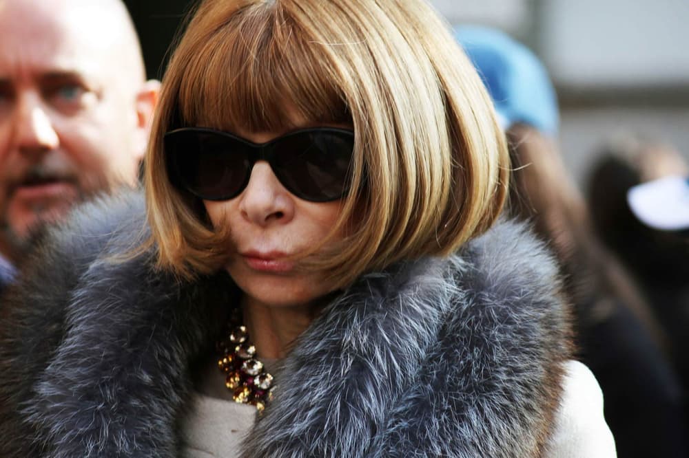
ARCHIVE RESEARCH / HOW ANNA WINTOUR CHANGED THE WAY THE WORLD GET DRESSED?
When Anna Wintour arrived in the editor’s chair at American Vogue in 1988, Ronald Reagan was US president. The White House has seen five further incumbents since then; Wintour, by contrast, has not budged an inch. When the curtain goes up on New York fashion week later this week she will be watchful and inscrutable behind the ever-present sunglasses, the waxed Cadillac curves of her power bob ensuring she can be seen from every seat in the house.
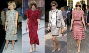
Wintour has changed how the world gets dressed, in a way that has nothing to do with following trends. (“Trends,” she once said, “is a dirty word.”) She is the key architect of one of the prime aesthetics of our era, which is that of soft power. She has always been as much about power as she is about fashion, and her biggest impact has been on the clothes we see on television screens and newspaper front pages, not on catwalks.
Two decades of First Ladies in patterned shifts and colourful cardigans; a million brightly coloured, form-fitting dresses worn by newsreaders and TV presenters all over the world; a brace of new-generation British duchesses dressed in slender tailored coats and skin-tone shoes; even Theresa May’s strong-and-stable necklaces and Keeley Hawes’s power bob in Bodyguard – from behind those sunglasses, Wintour has masterminded much of it. That she was repeatedly linked with ambassadorial roles, when she was close to President Obama, may owe at least some of its traction as an idea to how perfectly one can picture it.
But had Wintour’s reach been confined to those of us who watch her at fashion week, her impact would not have been nearly so profound. As it is, she has been as high-profile in Hollywood as she has been in Manhattan. She is one of the great fictional characters of our age. Her iconography is so deeply engraved in our psyche that Miranda Priestly, the Meryl Streep version of Wintour in The Devil Wears Prada, has become a template for the modern alpha female. The role of Wintour has been played, also, by Wintour herself in the Vogue documentaries The September Issue and The First Monday in May, and in cameos in Zoolander 2 and Ocean’s Eight. How much of the character is based on real life is anyone’s guess. But even after 30 years, the audience can’t get enough.
Sunday, January 6, 2019


A SMART HOLISTIC LIFE / CONCEPT / BRAND NAME
As my final outcome for this brief, I have decided to create a set of three luxury cosmetics - face creams. Each cream will have a different name; Snapchat, Twitter and Instagram for a different time of the day; morning, afternoon and evening.
Before starting a design I had to come up with a couple of different names for my brand.
* Daily Elixir
* SM - as a representation of Social Media.
* STI - as a representation of Snapchat, Twitter and Instagram, also S should stand for a social media.
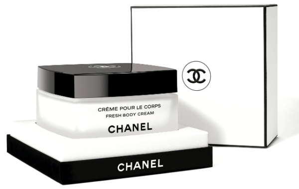
As I want my brand to look luxury I have looked at different already existing, luxury cosmetic brands such as; Dior, Este Lauder, and Chanel to get some inspiration. I love simplicity when it comes to logo and packaging design. The packagings are clear with the use of limitation of colours 1 to 2. Also, I have noticed if the logo uses Sans Serif font and rest of the text is in a serif font to make the design consistent and clear.
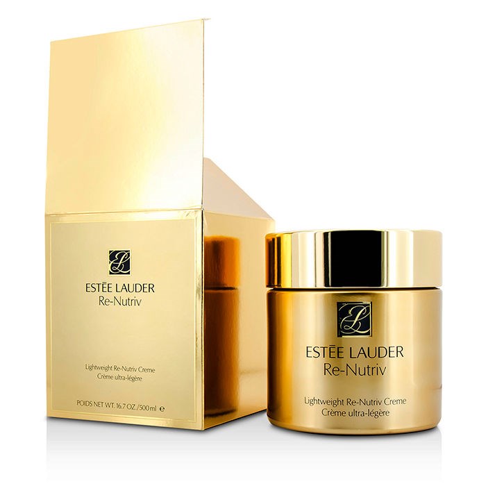


Based on my research I have created a logo design for my brand. The inspiration has been taken from the Este Lauder logo. 'SM' stands as a representation of Social Media. The use of gold colour made the logo look luxury.

As I want my brand to look luxury I have looked at different already existing, luxury cosmetic brands such as; Dior, Este Lauder, and Chanel to get some inspiration. I love simplicity when it comes to logo and packaging design. The packagings are clear with the use of limitation of colours 1 to 2. Also, I have noticed if the logo uses Sans Serif font and rest of the text is in a serif font to make the design consistent and clear.
Based on my research I have created a logo design for my brand. The inspiration has been taken from the Este Lauder logo. 'SM' stands as a representation of Social Media. The use of gold colour made the logo look luxury.

Thursday, January 3, 2019
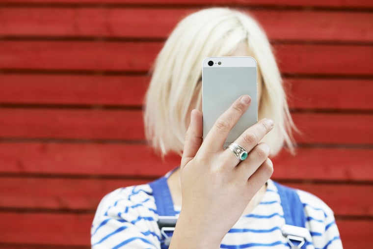
A SMART HOLISTIC LIFE / INSTAGRAM, SNAPCHAT & TWITTER
Instagram
Snapchat is a mobile app for Android and iOS devices. It’s headed by co-founder Evan Spiegel. One of the core concepts of the app is that any picture or video or message you send - by default - is made available to the receiver for only a short time before it becomes inaccessible. This temporary or ephemeral, the nature of the app was originally designed to encourage a more natural flow of interaction.


Instagram is a social networking app made for sharing photos and videos from a smartphone. Similar to Facebook or Twitter, everyone who creates an Instagram account has a profile and a news feed.
When you post a photo or video on Instagram, it will be displayed on your profile. Other users who follow you will see your posts in their own feed. Likewise, you'll see posts from other users whom you choose to follow.
Instagram has come a long way since its early days in terms of posting options. When it first launched in 2010, users could only post photos through the app and add filters without any extra editing features.
Today, you can post both directly through the app or from existing photos/videos on your device. You can also post both photos and videos up to one full minute in length, and you have a whole bunch of extra filter options plus the ability to tweak and edit. Instagram has up to 23 filters you can choose to apply to both photos and videos. You can also apply editing effects that allow you to edit adjustments, brightness, contrast, and structure.
Instagram is owned by Facebook.
Snapchat
Snapchat is a mobile app for Android and iOS devices. It’s headed by co-founder Evan Spiegel. One of the core concepts of the app is that any picture or video or message you send - by default - is made available to the receiver for only a short time before it becomes inaccessible. This temporary or ephemeral, the nature of the app was originally designed to encourage a more natural flow of interaction.
Snapchat was initially focused on private, person-to-person photo sharing, but you can now use it for a range of different tasks, including sending short videos, live video chatting, messaging, creating caricature-like Bitmoji avatars, and sharing a chronological “story” that’s broadcasted to all your followers. There’s even a designated “Discovery” area that showcases short-form content from major publishers like Buzzfeed.
Snapchat is owned by Evan Spiegel.
Twitter
Twitter is an online news and social networking site where people communicate in short messages called tweets. Tweeting is posting short messages for anyone who follows you on Twitter, with the hope that your messages are useful and interesting to someone in your audience. Another description of Twitter and tweeting might be microblogging.
Some people use Twitter to discover interesting people and companies online, opting to follow their tweets.
In 2014 twitter added a new feature in an update that makes it feel a lot more like an Instagram, as people are able to add filters to their pictures.
Twitter is owned by Evan Clark, Biz Stone and Jack Dorsey.
A SMART HOLISTIC LIFE / WHAT'S THE BEST TIME TO POST PICTURES?
During my research, I have found numerous websites which contain different articles about the times which are the best to post pictures on social media such as Instagram, snapchat and twitter. As I would like to create a set of three creams for each time of the day I thought I could base my concept on this.
What's the best time to post on Instagram?
Based on my research I have found that the best time to post pictures on Instagram is evening or late afternoon from 5pm as it 'seems to make sense because it's the time most people are wrapping up at work and possibly procrastinating on social media before they go home for the day.' Reference

The best time to post on Twitter is early afternoon from 11am to 2pm mainly because a lot of people use Twitter as a sort of digital newspaper, scrolling through content on their downtime or when they sneak in a break at work. Reference
What's the best time to send pictures on Snapchat?
There is no specific time to send pictures on Snapchat as the way the app works is a bit different than Instagram or Twitter. Snapchat only allows the public to send their taken photos to friends from the list. Some people believe that the best time to send pictures on snapchat is early in the morning as everyone is starting their day. People are, taking photos of how they look like, what they are having for breakfast and where they are going etc.
Based on my research I have realized that each of the social media apps has a different time of posting/ sending pictures etc. This allows me to make a set of three facial creams (morning, afternoon and evening to show the difference between those three social media apps.
What's the best time to post on Instagram?
Based on my research I have found that the best time to post pictures on Instagram is evening or late afternoon from 5pm as it 'seems to make sense because it's the time most people are wrapping up at work and possibly procrastinating on social media before they go home for the day.' Reference

What's the best time to post on Twitter?
The best time to post on Twitter is early afternoon from 11am to 2pm mainly because a lot of people use Twitter as a sort of digital newspaper, scrolling through content on their downtime or when they sneak in a break at work. Reference
What's the best time to send pictures on Snapchat?
There is no specific time to send pictures on Snapchat as the way the app works is a bit different than Instagram or Twitter. Snapchat only allows the public to send their taken photos to friends from the list. Some people believe that the best time to send pictures on snapchat is early in the morning as everyone is starting their day. People are, taking photos of how they look like, what they are having for breakfast and where they are going etc.
Based on my research I have realized that each of the social media apps has a different time of posting/ sending pictures etc. This allows me to make a set of three facial creams (morning, afternoon and evening to show the difference between those three social media apps.
A SMART HOLISTIC LIFE / RESEARCH / ADOBE PHOTOSHOP CREAM
During my research, I have found a campaign of adobe photoshop facial cream which is similar to what I am planning to do. This day cream is creatively named Adobe Photoshop. On the pictures below you can see how this cream is supposed to help women get a nice and smooth skin. An advertising company for this cream is also very unusual, as it shows two sides of celebrities' faces: the Photoshopped and the real one.


The campaign for Adobe Photoshop Day Cream, illustrating the level of artifice involved in putting together these campaigns using Beyonce, Gwyneth Paltrow, and Madonna. The Photoshop debate will always be something that fires up every few months. A little touch up to disguise a red blotch or spot does no harm but when a brand takes it to the extreme and the celebrity or model look completely unrecognizable as a member of the human species – that’s when the use of Photoshop becomes too much.
The beauty world has become so heavy handed with Photoshopping that the Advertising Standards Commission has recently had to step in, with L’Oreal, Maybelline, and Lancome all being read the riot act for their heavy-handed tampering with famous faces. They are not alone in this.
The biggest recent Photoshop fails were campaigns featuring Beyonce and Frida Pinto, which were heralded all over the internet with allegations that both had had their skin lightened by the magic brush of air! The list of brands choosing to abolish all reality from their famous campaign-fronters, in favor of pore-less, line-less, colourless mannequins is endless. It's getting silly! The campaign for Adobe Photoshop Day Cream, illustrating the level of artifice involved in putting together these campaigns using Beyonce, Gwyneth Paltrow, and Madonna. The Photoshop debate will always be something that fires up every few months. A little touch up to disguise a red blotch or spot does no harm but when a brand takes it to the extreme and the celebrity or model look completely unrecognizable as a member of the human species – that’s when the use of Photoshop becomes too much.
Wednesday, January 2, 2019
A SMART HOLISTIC LIFE / CONCEPTS
* My first idea is to create a set of facial creams as a representation of social media/programs which are giving an ability to edit the picture and use filters. Instagram, Facebook, Twitter, Camera roll and Photoshop. Each cream will be for a different time of the day such as morning, afternoon and evening.
* The second idea is to create a makeup set containing foundation, powder, and lipstick as a representation of each social media. The concept behind is to show the difference between them but at the same time show that they all work based on the same idea (giving the public an ability to make themselves look better).
* The third idea is similar to the second one about creating a makeup set, but instead of it I could design a face cream, elixir and foundation.
Feedback:
The feedback was very positive as tutors liked my ideas especially the second one with the makeup kit. Regarding the first idea, I have been suggested to stick only to social media photo filters or only to programs such as Photoshop etc because mixing them up will create confusion. I have been also suggested to do more research based on what time of the day people prefer to post images on chosen social media.

A SMART HOLISTIC LIFE / ONLINE VOTING
I have found an online live poll where people are voting on how much in their opinion has social media ever made them feel worse about themselves? Based on the votes most people agreed to that social media has made them feel worse about themselves before.

A SMART HOLISTIC LIFE / JESSICA WAKEMAN
Your favorite selfie filter could be contributing to a mental health crisis
The filters made available to users and invisible to viewers are creating an unrealistic portrait of what people look like. - Manipulating our own images has become such a part of our lives that there’s no going back now.
If you’ve ever aggravated someone — even a stranger — by asking them to take and re-take photos until you have one that’s "just right" to post on social media, the proliferation of filters and editing apps for your phone was probably an exciting development for you. The real problem, however, is that taking, looking at and sharing edited images of ourselves is fostering a fixation on how we look to others, to the point where it’s a mental health crisis unfolding before us.
Earlier this year, the Royal Society for Public Health in the UK released #StatusOfMind, a report on the impact of social media usage on mental health. They surveyed 1,500 youngsters aged 14 to 24, and asked 14 questions about their mental wellbeing and usage of YouTube, Snapchat, Facebook, Pinterest and Twitter.
Every single platform, other than YouTube, was associated with users' anxiety and depression. In fact, use of the two most image-centric platforms, Snapchat and Instagram, were ranked lowest for users’ well-being, particularly pertaining to bullying and “fear of missing out” (or FOMO) And in news that will not surprise anyone who has looked at the #thinstagram hashtag, Instagram scored poorly related to body image and anxiety.
The UK survey is hardly the first to document the link between social media usage and poor mental health. A 2014 survey from University of Pittsburgh’s Center for Research on Media, Technology and Health asked 1,787 young adults ages 19 to 32 about their mental health and how often they used 11 different social media platforms: Facebook, YouTube, Twitter, Google Plus, Instagram, Snapchat, Reddit, Tumblr, Pinterest, Vine and LinkedIn.
''The filters made available to users and invisible to viewers are creating an even less realistic portrait of what other people and their lives looks like, to the detriment of some.''
They found that using seven or more platforms was correlated with triple the risk of having anxiety or depression, compared with those who used only one or two. (If seven platforms sounds like a lot, look at that list and ask yourself how many accounts you have; I have nine.)
Manipulating our own images has become such a part of our lives that there’s no going back now; even if Snapchat or Instagram removed its filters, other apps would simply take their place. The best we can hope for is for apps to be more transparent about the manipulation of the images they're helping to disseminate, for the health (and, perhaps ultimately the safety) of their own users
Jessica Wakeman is a writer and editor in Brooklyn. She has written for Glamour, Bust, Rolling Stone, Nymag.com The Cut and numerous other publications.
Subscribe to:
Comments (Atom)