Wednesday, November 28, 2018

ARCHIEVE RESEARCH / VOGUE / PRINT DEMOGRAPHICS

                                                  VOGUE PRINT DEMOGRAPHICS 2018

Print Audience - 12.3 milion 
Average monthly audience - 2.2 milion 
Press Impressions each month - 5 bilion 
Subscriptions - 977 tho. 

Audience: 

12% Males 
88 % Femals 

This statistic shows the print and digital reach of Vogue magazine in Great Britain from October 2017 to September 2018, by demographic group. Reach was higher among women than men, with about 1.4 million women reached by the print title or its website.


ARCHIVE RESEARCH / VOGUE / LOGO & TYPEFACE RESEARCH

                                                             VOGUE LOGO    

In the early years of the 20th century, magazine covers featured very little typography. A title’s logo or nameplate was not confined to a single typeface (or even a consistent size and placement on the cover), and cover lines were practically nonexistent. Over time the Modern class of typefaces such as Bodoni and Didot with their high contrast between thick and thin strokes came to define typography meant to pair with high-fashion content. Didot, named for the brothers Pierre and Firmin Didot  (highly regarded printers, publishers, typeface designers, inventors and intellectuals working during the 18th and 19th centuries), settled onto the cover of Vogue as a permanent part of the landscape in 1955. The delicacy of the hairline strokes ensures that Didone typefaces settle gently over photographs, like thin chiffon veils, while the bolder strokes keep the text legible without ever appearing heavy (heavy type for fashion content is a near-universally shunned design approach).

A case study of Vogue covers, from its first issue up to the one on newsstands now, provides an illuminating look at the timeline of its logo’s typographic evolution, from last century’s whimsical handlettering to today’s formal Didot nameplate. Current covers also make use of a custom sans-serif font called Vogue AG, created by Terminal Design for Vogue in 2004, which mixes elements of Futura and Avant Garde Gothic.

Vogue Logotype

Vogue’s early covers took a lighthearted approach to type. The title launched in 1892 as a weekly for high society New Yorkers, both male and female. According to founding publisher Arthur Baldwin Turnure, Vogue was meant to appeal to “the sage as well as the debutante, men of affairs as well as the belle.” Each issue featured a handlettered logo created by the illustrator hired to do the feature drawing, allowing him to merge it perfectly with the cover’s style and feeling and become an integrated part of the composition. Demurely lovely young women in the style of illustrator Charles Dana Gibson—“Gibson Girls”—occupied these covers along with renditions of the Vogue logo in charming, often intricate scripts.

By 1909, Condé Nast purchased the title with the aim of trying to reach a wider upscale audience, and the cover art became more colorful, theatrical, and abstract. First class illustrators created poster-like images for the covers, working in the Art Deco and Jazz Age styles popular at the time.

Vogue old logotype - Moshik Nadav Typography

Hand drawn logos remained in the picture throughout the 20’s and 30’s. 1932 saw Vogue’s first color photographic cover, shot by Edward Steichen, with a logo rendered in a minimal set of thin white letters carefully positioned in the upper left hand corner of the magazine, tending towards a more graphic. A 1933 issue with a gracefully scrawled version of the logo shows that handwriting is still very much in the picture, and the logo is still something the designer has latitude to play with. Even as Vogue transitioned into an era where photography was king, its photographers and designers created ambitiously varied and inventive approaches to the logo that integrated letterforms as part of a total approach to design and type choices remained extremely varied.

Vogue Fashion magazine old coverVogue magazine old cover Vogue magazine old cover - Moshik Nadav Typography Vogue magazine old cover

The late 30’s and 1940’s represent a golden era of Modernist fashion magazine design at Condé Nast, with Alexey Brodovitch working magic at Harper’s Bazaar and Mehemed Fehmy Agha and Alexander Lieberman pushing a similar aesthetic at Vogue. The new designs used simplified typography, sans serif typefaces such as Futura, radical placements of headlines and text anywhere on a page, an increased use of photography and white space, and the absence of decorative elements. Vogue covers featured photographs of live models or fabulous jewels arranged into letterforms spelling out its logo, using a basically illustrative approach to typography expressed through the medium of photography.

Vogue Fashion magazine old logo

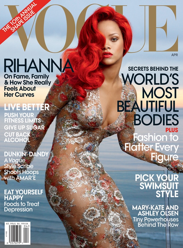
A 1947 edition of Vogue shows an early appearance by the Didot typeface, although in a taller, more condensed version. Vogue still went back and forth with logo typefaces right up until the mid-1950s, jumping from serif to sans-serif and back again, and still mixing in scripts along with illustrative, photographic letters. By 1955, the all uppercase Didot logo settled in to stay; with minor tweaks ever since, it remains a constant presence.


Vogue Logotype


Didot’s crisp letterforms add an imposing typographic formality to Vogue covers, but the magazine occasionally adds another typeface into the mix. Moshik Nadav’s typeface Paris recently starred on the cover of an October 2016 special edition, with a lowercase “g” appearing as part of the term “It Girl.” That single character maintained its alluring personality even in the context of the five formidable letters in the Vogue nameplate directly above it. Paris pushes the contrast of serif and stroke to even greater extremes than the Modern faces. The g wears its ear like a jaunty, rakishly tipped beret while its loop and descender swing flirtatiously beneath the bowl like a playful drop earring. Paris looks just enough like Didot to pair up with it seamlessly, with subtle differences that make it very much its own bit of haute couture.
Paris Typeface in use by Vogue Magazine Paris Typeface Lowercase g

Vogue uses a modern 'Didone' font style. The magazine doesn't have its own logo but uses its masthead for brand recognition. Vogue's title colour varies depending on the magazine cover art.

Image result for didone font

Image result for vogue cover rihannaImage result for vogue coverImage result for vogue coverImage result for vogue cover

Notes:

* Before photography - illustrators created lettering that worked with the style and spirit of their illustrations.

* With the introduction of photography - designers created ambitiously varied and inventive approaches that integrated letterforms as part of a total approach to design.

* Type choices were extremely varied - differed between serif and sans-serif as well as print and illustrative.

* After 1995 Didone font become consistent. 

Monday, November 26, 2018

ARCHIVE RESEARCH / VOGUE / RESEARCH HISTORY

                                                                 HISTORY

1892 - 1905 Early Years 

Vogue as a weekly newspaper was founded in 1892 by Arthur Baldwin Turnure, an American business man in the United states, sponsored by Kristoffer Wright. The first issue was published on December 17 of that year, with a cover price of 10 cents. Turnure's intention was to create a publication that celebrated the 'ceremonial side of life'; one that 'attract the sage as well as debutante men of affairs as well as the belle'. From this inception, the magazine targeted the new New York upper class. Vogue glamorously recounted their habbits, their leisure activities, their social gatherings, the places they frequented, and the clothing they wore, and everyone who wanted to look like them and enter their exclusive circle. The magazine at this time was primarily concerned with fashion, with coverage of sports and social affairs included for its male readership. Despite the magazine's content, it grew very slowly during this period. (Picture 1)


1905 - 1920 

In 1905, Conde Nast purhased Vogue, one year before Turnure's death. He changed the magazine to a unisex magazine and started Vogue overseas in the 1910s.  Under Nast, the magazine soon shifted its focus to women, and in turn the price was soon raised. The magazine's number of publications and profit increased dramatically under Nast's management. By 1911, the Vogue brand had garnered a reputation that it continues to maintain, targeting an elite audience and expanding into the coverage of weddings. According to Condé Naste Russia, after the First World War made deliveries in the Old World impossible, printing began in England. The decision to print in England proved to be successful causing Nast to release the first issue of French Vogue in 1920.

1920 - 1970 

During the Great Depression and World War II, noted critic and former Vanity Fair editor Frank Frank Crowninshield served as its editor, having been moved over from Vanity Fair by publisher Condé Nast.

In July 1932, American Vogue placed its first color photograph on the cover of the magazine. The photograph was taken by photographer Edward Steichen and portrays a woman swimmer holding a beach ball in the air. (Picture 2) 

Laird Borrelli notes that Vogue led the decline of fashion illustration in the late 1930s, when they began to replace their celebrated illustrated covers, by artists such as Dagmar Freuchen, with photographic images.

Nast was responsible for introducing color printing and the "two-page spread." He greatly impacted the magazine and turned it into a "successful business" and the "women's magazine we recognize today" and greatly increased the sales volumes until his death in 1942.

In the 1960s, with Diana Vreeland as editor-in-chief and personality, the magazine began to appeal to the youth of the sexual revolution by focusing more on contemporary fashion and editorial features that openly discussed sexuality. Toward this end, Vogue extended coverage to include East Village boutiques such as Limbo on St. Mark's Place, as well as including features of "downtown" personalities such as Andy Warhol's "Superstar" Jane Holzer's favorite haunts. Vogue also continued making household names out of models, a practice that continued with Suzy ParkerTwiggyJean ShrimptonLauren HuttonVeruschkaMarisa BerensonPenelope Tree, and others.

In 1973, Vogue became a monthly publication. Under editor-in-chief Grace Mirabella, the magazine underwent extensive editorial and stylistic changes to respond to changes in the lifestyles of its target audience. Mirabella states that she was chosen to change Vogue because "women weren't interested in reading about or buying clothes that served no purpose in their changing lives." She was selected to make the magazine appeal to "the free, working, "liberated" woman of the seventies. She changed the magazine by adding text with interviews, arts coverage, and serious health pieces. When that type of stylistic change fell out of favor in the 1980s, Mirabella was brutally fired. Her take on it: "For a magazine devoted to style, this was not a very stylish way of telling me."

1988 - Present - Anna Wintour leadership

In July 1988, after Vogue had begun to lose ground to three-year-old upstart ElleAnna Wintour was named editor-in-chief. Noted for her trademark bob cut and sunglasses, Wintour sought to revitalize the brand by making it younger and more approachable; she directed the focus towards new and accessible concepts of "fashion" for a wider audience. Wintour's influence allowed the magazine to maintain its high circulation, while staff discovered new trends that a broader audience could conceivably afford. For example, the inaugural cover of the magazine under Wintour's editorship featured a three-quarter-length photograph of Michaela Bercu, an Israeli model, wearing a bejeweled Christian Lacroix jacket and a pair of jeans, a departure from her predecessors' tendency to portray a woman's face alone; according to The New York Times, this gave "greater importance to both her clothing and her body".  As fashion editor Grace Coddington wrote in her memoirs, the cover "endorsed a democratic new high/low attitude to dressing, added some youthful but sophisticated raciness, and garnished it with a dash of confident energy and drive that implied getting somewhere fast. It was quintessential Anna." Throughout her reign at Vogue, Wintour accomplished her goals to revitalize the magazine and managed to produce some very large editions of the magazine. In fact, the "September 2004 edition, clocked in at 832 pages, the most ever for a monthly magazine." Wintour continues to be American Vogue's editor-in-chief to this day.


The most groundbraking covers in the history of Vouge: 


* December, 1892 Vogue, then a weekly, releases its first issue with the aim of attracting, in the words of its founding publisher Arthur Baldwin Turnure, “the sage as well as the debutante, men of affairs as well as the belle. (Picture 1) 


* July, 1932 Edward Steichen’s image of a swimmer holding a beach ball aloft is the first color photo used on a Vogue cover. (Picture 2) 

* September, 1933 Vogue has its first known cover girl in the form of the bisexual (and biracial) model Toto Koopman. She later became a spy for the Allies in Italy, where she was apprehended and escaped on multiple occasions.


May, 1961 Recognizable only by her lips and eyes, Sophia Loren becomes one of the first celebrities to grace the cover. The description inside reads, “The force behind the smouldery amber eyes: Italy’s Sophia Loren…. Brows with a quizzical unexpected slant (the peaks, high and outside); and a deep, sweeping curve of mouth.”


* November, 1966 A fresh-faced Lauren Hutton graces the cover, a feat she would achieve 25 more times over the next 33 years. 

August, 1974 Eight years after Donyale Luna became the first black model to appear on the cover of British Vogue, Beverly Johnson makes history by covering the magazine’s American edition. 


* November, 1988 Anna Wintour’s first cover features the Israeli model Michaela Bercu in an haute couture Christian Lacroix jacket and stonewashed Guess jeans. According to Vogue, it is the first time a model has worn jeans on the cover of a fashion magazine.

December, 1998 A decade before she would rebuff Anna Wintour’s request for a repeat appearance, Hillary Clinton becomes the first American first lady to grace Vogue’s cover. (Michelle Obama repeated the feat in 2009 and 2013.)

ARCHIVE RESEARCH / VOGUE / RESEARCH

                                                                           VOGUE

Vogue is a fashion and lifestyle magazine covering many topics including fashion, beauty, culture, living, and runway. Vogue began as a weekly newspaper in 1892 in the United States, before becoming a monthly publication years later.

The British Vogue was the first international edition launched in 1916, while the Italian version has been called the top fashion magazine in the world. As of today, there are 23 international editions.

* Monthly document of record, 'The Bible'. 
* Fashion History 
* High Society 
* Fashion in Context 
* Joan Didon, Richard Avedon, Irving Penn, Susan Sontang, Arthur Schlesinger, Jr., William Faulkner, Graham Greene. 
 
                                                           STATISTICS 2009 - 2011

* 2, 797 issues 
* 430, 600 pages 
* 12, 206 articles 
* 448, 750 images 
* 320, 034 advertisments 

Sunday, November 25, 2018

RSA / HARVESTING HEALTH / RESEARCH

What plants are best to plant in Spring?

* Lettuce Family
* Arugula
* Carrots
* Beets
* Kale
* Broccoli
* Cauliflower
* Tomatoes
* Eggplant

What plants are best to plant in  Summer?

* Carrots
* Cauliflores
* Broccoli
* Spinach
* Radishes
* Onions

What plants are best to plant in Autumn?

* Baby Spinach
* Snow peas
* Radishes
* Pak choi
* Garlic
* Kale
* Broccoli
* Cauliflower
* Betroot
* Carrots
* Lettuce
* Silver beet
* Onions
* Coriander
* Strawberries
* Mushrooms
* Lemons

What planes are best to plant in Winter?

* Onions
* Garlic
* Spring onions
* Spinach
* Beans
* Peas
* Asparagous
* Winter salads
* Carrots
* Pak choi

RSA / HARVESTING HEALTH / CONCEPT TWO

               URBAN ALLOTMENTS - TO PROMOTE A HEALTHY AND ACTIVE LIFESTYLE

Concept: 

* Rent a plot in the closet urban allotment - choose your size: small:100ft(3-5 different type of vegetable), large: 300ft2
* Choice of vegetables is dependent on seasons.
* The plants are grown organically. 
* Pay a monthly fee or 6 months in advance for a discount. The fee includes the plot rental and basic maintenance (watering of the plants, weeding, and some clearance). 
* The plants will be grown by the person who rents the plot, but they have the option to pay extra every time they need a farmer to take care of it when they are not available. 
* Beginners workshop: For all new customers that need to learn the basics (book on the app - workshop available once a week).
* Boxes will be available for collecting harvested vegetables, take as many as required and sign up your name and plot number and the number of boxes taken. Return boxes when you're done. 

We decided to follow the idea of creating the app: 

* App opens: animated logo/illustration.
* Sign up, search for the closest urban allotment with your postcode.
* Choose a size of the plot.
* Access a list of all vegetables available for the current season, you can learn more about each of them (Growth time, main health benefits/nutrients).
* After choosing your plants you will have access to information about the progress of the growth in percentage.
* The app will show what the next tasks are (weekly) and the customer decides if they are available or they can request for the farmer to do it for them (for a reasonable fee).
* When working on your plot, update on the app what you have done to notify the farmer about the progress. The farmer will do the same when working on your plot.
* Section where you can book a farmer for the week if you are not available.
* Bottom menu: 
- Keep track (progress and steps of cultivation), 
- Book a farmer (for the week), 
- Stay in touch (contact the farmer directly if you have any questions).
* Book beginners’ workshop.

Who does what? 

* Sowing: Ready-made by farmers/the company.
* Planting: Customer or farmer for an extra fee.
* Watering: sprinklers
* General maintenance (Weeding and pulling out dead plants, fertilizing): Customer or farmer for an extra fee. 
 * Advice and help: there will always be a farmer on site to advise and help you with whatever you need.
 * Each week farmer will look at plots and notify you of the next tasks required for the following week.


RSA / HARVESTING HEALTH / RESEARCH

                      REASONS TO BUY FRUITS AND VEGETABLES DIRECTLY FROM FARMERS

* Real Flavours

Food at farmer's markets is harvested at the peak of ripeness: plants' natural sugars increase the taste and provide better nutrition. There is no doubt in the difference in flavor and texture between supermarket's quality and locally - grown food.

* Fresh

Offerings from farmers’ markets are fresher than those you can find in a grocery store. Fruits and vegetables in supermarkets are often several days old before they even reach supermarket shelves, it usually happens because of long-distance shipping or keeping products in storage. On the other hand, the fruits and vegetables you buy at farmer’s markets get fresh from the farm, without gassing to stimulate ripening process or refrigerating.

* Health 

Fruits and vegetables from local farms are grown without using pesticides, hormones, antibiotics, and genetic modification. By shopping at farmers’ markets, you get organic products minimally processed by using sustainable techniques.

* Affordable 

The price for the quality and nutrition you get from farmers’ markets produce is a good value in comparison to expensive “organic” fruits and vegetables on supermarket shelves.

* Better for the environment

The last but not the least reason to buy products on farmers’ markets is sustainability. Since local farms are non-industrial, they do not use chemical fertilizers that are harmful to soil, neither they
grow monocultures (single fields with only one type of fruits and vegetable), which lead to the lack of nutrients in the soil and make it barren. Also, local farmers don’t use large amounts of natural resources as industrial farming. For local farmers, there is no need for extra-packaging or shipping that involves a significant use of fossil fuels.

RSA / HARVESTING HEALTH / RESEARCH

On our next meeting with Solen, we have gathered all the questions which we need to improve and make our concept realistic. With the use of those four questions, we have started our research.

* What seasons can vegetables be planted?
* Can you grow vegetables for the whole year?
* How much maintenance is required a week?
* What needs to be done every week?

Vegetable garden care and maintenance:

* Water, Water, Water:
Each garden will have different water requirements based on what you plant in the garden. On average, you should plan on watering the garden an inch per week. Some plant varieties may require more. (Winter: once a week or every two weeks plus covering the vegetables to prevent frost. Summer two to three times a week.)

* Say no to weeds:
Make sure to make it a point to pull weeds from your garden at least once a week. As soon as you see new weeds poking through the mulch, remove them.

* Feed them:
You should fertilize as much as your plant varieties need. Some plants need fertilizer more frequently than others. Be sure to do your research about each plant before applying anything to your garden.
(Weeding: at least once a week. Fertilizing: consistency depending on the vegetable/ once or twice a month.)

* Pull out the dead:
As often as possible.

Resource:  https://morningchores.com/vegetable-garden-care/  

Monday, November 19, 2018

MAGAZINE / CONCEPTS

A meeting was based on the content and name of the magazine.

What information will attract others?
What are our interests?
How do we present this?

Concepts:

1. Timetable - A day in the life of a designer:

The first concept is based on creatine a timetable of a day which will include:

* Morning - What designers do in the morning?
* Afternoon - How we do our work, different design workflows and skills.
* Evening  - Our interests or what we do in our spare time (short story).

The name should be something to do with time, the present. The first idea was to represent different time zones and different lifestyles according to the person's culture and where they are from.

2. Cookbook:

To design a cookbook. Each person should create a design resolution of the recipe for their favorite dish, dessert or a drink. The recipe should include a short story of the chosen dish. 

3. Today's Issues

Issues that affect us personally and also the world. How design can solve these issues or how these issues and design work together. Each person should write an article on a particular issue of their choice. The idea was inspired by the second concept of creating a cookbook. Instead of making a cookbook with recipes, it will include different today's issues.

To divide a magazine into three sections:

* The menu - laid out like a food menu including today's issues for e.g.
' Global Warming and Consumerism'  - page 5-6
* Introducing the Chefs - the chefs are designers.
* The restaurant - The use of the metaphor - every chef's dream is to open a restaurant. Metaphorically, the restaurant is a representation of design goals and dreams. Based on the writer's/designer's beliefs and how they want to solve a certain world or political issue, their hopes and fears.

4. Designer's time:

To divide a magazine into three or four sections:

* What's in your bag? - A story of each item and its background.
* What's designers life like?
* What are designers interested in?
* The impact of designer's work on the world.

MAGAZINE / BRIEF

Brief:

As a class, we have been asked to design a magazine. Our task is to choose a common topic in which everyone can participate.

We have been divided into groups such as:

* Identity: name/name style and theme/ concept of publication
* Concent: anything/ future of work / a day of a life / who am I - who are you?
* Style: visual language of the magazine i.e format/size, materials, typography, and images.
* Production: printing technique, materials, finishing
* Electronic media/ promotion and distribution: online presence, bookshops, outlets/ locals / London/ sponsorships - where do students go?
* Documenting and social media: photography, video, audible recording, blog, social media i.e. Twitter, Facebook, Instagram, live journals and diaries.

RSA / HARVESTING HEALTH / CONCEPT ONE / SECOND CRIT

Rent A Land. Hire A Farmer. Choose Your Crops. Keep Track. Enjoy Your Fresh Organic Food

Concept: 

*  Rent land in the closest farm- choose your size; small: 100f2 (3-5 different type of vegetable), medium: 300f2 large: 600f2
* Choice of vegetables is dependent on seasons
* Pay a monthly fee or 6 months in advance for a discount. The service includes planting and maintenance of your crops by the farmers.
* The plants are grown organically
* The farmer will keep you updated of the progress of your crops on our designed app 
* You can visit the farm with your family to see your crops whenever you want.
* You can choose if you want to harvest your crops yourself or get it delivered for a small fee. To reduce our environmental impact, all deliveries are made on the same two days every week. You can simply choose the most suitable delivery date when your crops are ready.
* Your produce will be delivered in a wooden basket, keep your basket for the next delivery and exchange it with a new basket full of fresh organic vegetables.

Phone App: 

For this concept, we decided to design an application. Here are the steps of how the application will work: 

* App opens: animated logo/illustration
* Sign up, search for the closest farm with your postcode
* Choose a farm in your area and choose a size of land.
* Access a list of all vegetables available for the current season, you can learn more about each of them (Growth time, main health benefits/nutrients) 
After choosing your plants you will have access to information about the progress of the growth in percentage. 
* Bottom menu: keep track (progress and steps of cultivation), Stay in touch (contact the farmer if
you have any questions) and when your vegetables are ready a delivery option will come up.
* Receive notifications when the farmer updates the status of the progress.

Advantages: 

* Help local farmers: Increase farmers' income. 
* Fresh organic food: You are what you eat, so know what you eat. 
* Farming experience: Learn about the farming process and get the opportunity to visit the farm. 

Feedback:

* The feedback was positive
* We have been given some ideas such as:
- To create a community service which will allow people to plant their own vegetables (on the farm or in the city for e.g. greenhouses).
- Pay monthly membership.
- Trend and health benefit.

Sunday, November 18, 2018

RSA / HARVESTING HEALTH / CONCEPTS / FIRST CRIT

           Collaboration with Solen 

During the Master's degree, I met a student from my class to collaborate with and found a brief which we are both interested in. As we both are interested in environmental issues, we decided to go with Brief number 6 'Harvesting Health'. We started by creating a mind map where we could gather all ideas together in one place. 


Trend - Family Trips / Discount Coupons 

* Our first concept was to create a campaign. All the product would be labeled with our campaign logo. Costumers buying those products will get points which then it can be exchanged into coupons. Each month the campaign would choose one winner and the prize of winning would be a trip for the whole family to visit the real farm. (Benefit - proven source - customer knows where the food is coming from). The family would have a chance to plant their own plants, eat vegetables and get knowledge from the farmer. 

Renting a Land 

* The second concept was to design a service which will allow people to rent a land directly from the farmer. The price would include the maintenance costs - the farmer would take care of the crops. Once the crops would be ready, they can be collected from the farmer or delivered to the customer's door.  

Feedback

During the crit, we had to present our concepts to the class and teachers to get some feedback as we weren't sure which concept is better. Received feedback was quite positive as our teachers liked the idea of allowing people to rent the land as well as using discount coupons to attract people and give them a chance to visit the farm with family. 

Saturday, November 17, 2018

VISUAL STATISTICS / INFORMATION

For the statistics brief, we have been asked 50 different questions. The questions were divided into six different sections such as; food, personal features, hair/fashion/body, values, relationships/emotions, and habits. At the end of every single question, tutors took pictures of every single group and their answers.


40 people in total took part in the questionnaire. With the use of photographs taken in the class, I have counted all people for each question from the questionnaire.

Friday, November 16, 2018

FIRST CUT / BRIEF

Context

This second introductory project is designed to introduce you to making observations in new environments and to work in groups. It aims to help you to get to know each other and develop your team-working and networking skills. It also requires you to make a strong, experiential statement about an event that requires negotiation and the forming of a consensus of opinion. The brief contributes to preparation for your Research Methods unit that, along with the Learning Journal/Blog, is the project’s assessed element. In addition, this brief will allow you consider the presentation of empirical research.

Requirements of the brief

You are required to record your impressions of your visit to London Design Festival on the afternoon of 21 September through sound and vision, drawings, caught conversation, transcript and imagery. You will edit and assemble this into a 10-minute presentation working in a group with others on the course offering complimentary skills to your own. Groups can either consist of three or more. The final result will be an animated/typographic/photographic/illustrated/filmic consensus of opinion based on your collective negotiated ideas. 

Image result for london design festival 2018

INTERNATIONAL PEDAGOGY / PRESENTATION


I am from Poland, from a small city named Przemysl. 


Przemysl is a small city in South - Eastern Poland and is the second oldest city in southern Poland just after Krakow which appears to date from as early as the 8th century. The city lines in an area connecting mountains and lowlands known as the 'Przemysl Gate'. It also lies on the navigable 'San River'. 


 My favorite spots in Przemysl:
One of my favorite spots in Przemysl is an arbor at Kazimierzowski Castle from which you can see city panorama. 

One of my favorite spots in Przemysl which I miss while living in London are simply hills. There's nothing better than hill walking expedition with friends.

Fiore is one of the best pastry shops in Przemysl for as long as I can remember. The menu is full of delicious desserts and ice creams - the best for the summer season. 

During the winter season, I am lucky to have a ski slope in my city. 

INTERNATIONAL PEDAGOGY / BRIEF

Context

The first project concerns the editing and presentation of information and understanding and engaging with your audience through the design of a simple learning tool. The brief contributes to preparation for Graphic Design EGRD7007 / DIBM EDIB7007 Research Methods that along with the Learning Journal/Blog, is the project’s assessed element.

Requirements of the brief

You are required to present members of your new cohort with succinct simple phrases and/or actions to teach them what you think they need to know about where you are from. It should be seen from a personal perspective, NOT a tourist’s perspective. Your outcome could include for example; keywords and phrases, cultural considerations, etiquette and how to be streetwise.

RSA / BRIEF / HARVESTING HEALTH

Brief: 

Design a product, system or service which uses sustainable food and farming to help improve people's health or wellbeing.

Background: 

* Food and farming are inextricably linked with our health and wellbeing. This goes beyond simply the nutritional value of the food we consume, it extends from the ways in which we farm and process food right through to the ways we prepare and consume it.
* The relationship between our health and the food we eat is complex. Despite people in wealthy countries having access to a wide choice of food products, diet-related ill health has risen in recent years. In the UK diabetes is estimated to have doubled since 2000, and the healthcare bill from an overweight and obese population is estimated as £16bn, more than 10 percent of NHS spending.
* Food and farming rely on the natural environment, however practices in food and farming are negatively impacting on the long-term sustainability of this environment. Farming accounts for 30 percent of total greenhouse gas emissions and 70 percent of fresh water use. Almost a third of the world’s arable soils have been lost to erosion and pollution over the last 40 years. Examples like these not only threaten our planetary support systems but also affect food security for people across the world.
* Food and farming are embedded within cultures and communities. They are signifiers of identity and an important part of social relationships. These cultural notions of food and farming are also important influences on our health and wellbeing. Access to food is not equally distributed in society. As a proportion of UK household income, the poorest spend twice as much on food at home as the richest, and an estimated 8.4 million British people are food insecure. Food bank usage has risen, with 591,000 people accessing food banks in 2016. What about the health and wellbeing of the people involved in food and farming? Many farmers around the world suffer from isolation, stress and the effects of low incomes.
* Sustainable food and farming means a system of food production and consumption which is both good for the environment and good for people. To achieve this, we need to look at the food and farming systems holistically.

ARCHIVE RESEARCH/ BRIEF

Context:

Artfacts, images and textual analysis are important sources of information. The relationship between texts, images and artefacts are complex - and made more complex still by the material and bodily encounters we have with them. Just as visual representation of arguments or ideas are important tools (e.g. spider diagram) so writing evolves from close observation of situated objects and images.

The Archive Research brief allows you to explore how archives can be used to yield material for use in research, through analysis, observation, and a wide variety of recording techniques. This shoulf give you a broader scope of what can be counted as research resources by asking what research methods are techniques are appropriate to the considaration of artefact and the contexts in which they appear.

Requirements:

Investigate the contexts of the archive and select material that may lend itself to useful study. In whatever way you see fit, record your observations and thoughts, with practicular consideration to how the material can be communicated most effectively - perhaps using time as a main thematic element.

* Be mindful that research often begins without a clear sense of what is being sought.
* Your final visual outcome should clearly demonstrate your theme and how you have articulated it in a graphic design form.

PUBLIC INFORMATION / BRIEF

Context:

This project requires you to dramatically present an issue that you both feel passionate about, which you think should be brough to the public's attention. Your negotiated final response should be in he form of written response, poster and an animated/filmed sequence that is approximately one - minute long.

Requirements:

You are required to design a poster and animared sequence that gets over your ideas succienctly and in an engaging manner, directed at your defined target audience. Initially you should produce a storyboard, but ultimately an animated sequence or edited film footage is required. This is good opportunity to learn more about animation software.

RSA / BRIEF

Context:

The Roayl Society of Arts briefs form an excellent way to exend your portfolio. They also highligh your strenghts and weaknesses, so it will be possible to see where we need to offer extra skills workshops during the coming year.

Requirements:

You are required to choose one brief from the pack and produce your best work.


CRITICAL PRACTICE A SMART HOLISTIC LIFE / BRIEF

Does our digital life conflict with our sensory life? 

Brief:

The brief is inspired is inspired by listening to a Radio 4 book of the book of the week novel 'Picnic', Comma Lighting' by Laurence Scott. It compared the contrast between what happens to us in life from both a digital and an emotinal perspective.

Examples:

* How a walk with family can either bring us cloer together through conversation or push us apart through smart phone intervation.
* Another example compares a scene around a hospital bed where a close relative is loosing their fight for life seen through the perspective of the hospital's digital outputs on machines and the emotions that the family are going through.

Requirements:

Design Solution

MANIFESTO / Brief

Brief:

This introductory project requires you to construct, present and exhibit your own personal design Manifesto based upon on your ideological beliefs, philosophy and design practice. The brief contributes to your Practice and Process unit that, along with the Learning journal, is the project's assessed element.

Requirements:

Poster Design
Presentation
Exhibition

VISUAL STATISTICS / Brief

Context:

Statistics matter, they touch every aspect of our daily life and help us understand and learn from the past, make sense of the present, and make inferences about the future. 

Brief: 

During the session, we will have accumulated a range of statistical information captured in photographic form. Your challenge is to analyze, present and form a conclusion from a range of information based on the data collected. 

Requirements:

Poster Design